On April 21, Google introduced a new update: a worldwide mobile-friendly algorithm. It impacts our mobile search results, meaning mobile-friendly sites will have the opportunity to rise above their competitors who haven’t invested in a mobile strategy. This new update will affect how eCommerce websites will be built going forward. Could it be time to upgrade?
With this new algorithm upgrade, Google will review your website and see how mobile-friendly it is. If your website is not particularly suited for mobile, customers will be less likely to stumble across your company on their phones. Let’s say you sell touchscreen coffee tables. Potential customer Bob Plufferton is interested in purchasing one and need to do research. He’s a tech-savvy fellow and he types the search words into his smartphone. However, when your website is not mobile-friendly, your competitors’ websites rank higher. Bob is now perusing their webshop instead of yours. Imagine how many potential customers you are inadvertently missing.
Move into the mobile market
As technology advances, there is an emphasis on the mobile market for eCommerce. Customers are increasingly mobile and have an array of technological capabilities at their fingertips. They have access to a massive amount of content and information and their attention is split every which way. The question we must ask ourselves is: How do we get to where our customers are?
The new Google update gives even more incentive to act. This is where the industry is headed and we need comprehensive solutions that address these challenges. (Mobile has already surpassed desktop in Google searches.) In eCommerce, we focus a lot on the experience we want customers to have. In order to move forward and plan strategically, we must think of ways to obtain new customers and what technology we can leverage. An eCommerce website is one of the main marketing tools and acts as a salesperson in many cases, providing the appropriate information when needed, allowing the customer to explore their options.
What does it mean for you?
Without a mobile-friendly or a dedicated mobile site, the new algorithm means you may not be showing up on a customer’s mobile search. Google will show your customers websites that are properly formatted for phones, showing preference for the ones that will give customers what they’re looking for, including a smooth user experience. You could be losing out on lots of sales opportunities.
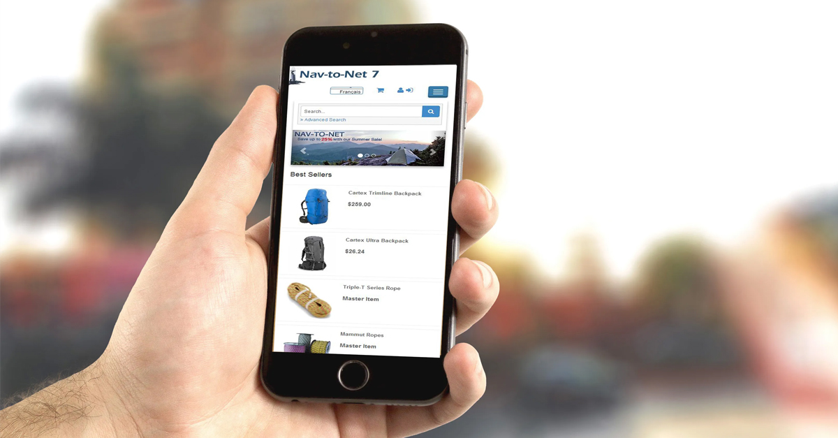
What does it mean to be mobile-friendly?
Being mobile-friendly means that the content and layout is optimized for a smaller screen size. With such limited screen real estate, the content has to convey a message quickly and effectively. Some common characteristics of a mobile-friendly site are:
- Simplified navigation
- Optimal layout for content and images
- Easy call-to-action links that don’t affect website’s functionality
- Forms and checkout are optimized for the mobile device
Responsive design trend
Responsive Design is a trend that is here to stay, with the ease of managing one site but being able to optimally display it across multiple screens and platforms. Check out this blog post we wrote earlier discussing the merit of Responsive Design as an investment in your eCommerce website strategy.
Thinking mobile

Taking on Responsive Design changes the way your website is perceived; the content must be adapted and crafted to fit each screen and device and some organizational changes have to be made. You’re now tackling a mobile market with a different set of expectations, customer behaviours, and maybe even competitors.
Browsing is common on mobile so optimize your site for quick searches. Customers have different habits when they browse on mobile as opposed to on a desktop so that’s worth keeping in mind when designing your site. Mobile devices have become faster with improved usability; make sure your eCommerce website experience is smooth and intuitive, matching the updated technology.
Let’s say you sell cosmetics and beauty products. It’s such a broad topic – as a customer, I could be looking for a specific product, for a brand, for inspiration, to see what’s new. What if there is a B2B aspect to your website? As part of a dealer network, can your dealer use your website effectively on the go? Anticipate and present your website accordingly. Now the user perception is not “that’s a comprehensive website” but “I found what I was looking for quickly”.
Steps to take
Use this website to determine if your website is mobile-friendly or not.
After knowing your current situation, you can then determine your next steps. Where are you in terms of updating your website? Your platform? Is a redesign in the talks that is now pushed to top priority? Do you have a mobile site? Is Responsive Design the better option?
Take note of your website’s statistics and how it performs across different platforms. When you make changes, especially one as significant as this decisive step into the mobile market, it’s prudent to know where you are and how each change affects the results.
With new design comes new processes, strategies, and ways of thinking.
Talk to us today about your mobile needs and if Responsive Design is the right choice for you.
Request a Demo | Responsive Design Brochure | Explore Nav-to-Net™
